Aug-Dec
Other Studio Pages:
2004 (Aug-Dec) | 2005 (Jan-May) | 2005 (May-Aug| 2005 (Aug-Dec) | 2006 (Jan-Apr) | 2006 (May-Dec) |2007 (Jan-Aug) | 2007 (Aug-Dec) | 2008 | 2009 | 2010 | 2011-2012 | 2013 | 2014-16 | 2017 | 2018 | 2019
Click on images below to ENLARGE
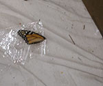
Lucky misfortune prevails. With the exhibit preparations, take-downs, studio visitors--haven't had time to work intensively on a large piece. Now have all kinds of things in progress. The strange frame pastel might go stripped in the frame. An old small computer-fresco piece (Not Mondrian), having annoyed me for a long time is going to be partly painted out and redone. I've started a 30" x 20" painting, Whispers. Two pieces of color-stained paper are going to be scanned, manipulated in the computer, and attached to some art work. Two other works on paper are about to become something. I've sized the back of a large block print, in order to attach it to canvas and start a painting. Finally, I've shot a couple images I want to use: a butterfly wing on cellophane, and a section of my studio tarp.
![]()
![]()
![]()
![]()
![]()
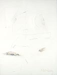
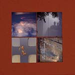
![]() weird frame
weird frame ![]()
![]()
![]()
![]()
![]()
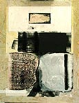
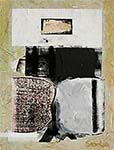
![]() Not Mondrian
Not Mondrian ![]()
![]()
![]()
![]()
![]()
![]()
![]()
![]()
![]()
![]()
![]()
![]() Whispers
Whispers
![]()
![]()
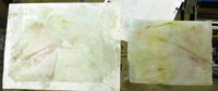
![]() stained paper
stained paper![]()
![]()
![]()
![]() two possibilities
two possibilities![]()
![]()
![]() large block print
large block print
![]()
![]()
![]()
![]() butterfly on cellophane
butterfly on cellophane![]()
![]()
![]()
![]() paint splatter
paint splatter
8/23
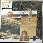
Finished Mondrian Anew. I added chairs (there being two was important) and a green tree top to the objects I chose not to overpaint: the Mondrian-esque shapes (including the nude's "head"), the "ergo," the globe from a different perspective, and the dome. After struggling both compositionally and conceptually with various images to add, ended up with a nothingness center yet a DNA-ish "S" composition. Originally titled the piece "Not, Anew," but then realized how important the Mondrian connection was.
8/29
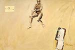
Rare revisions. Changed Sigma, to make face have stronger-yet-vague look, to add atmospheric perspective to arms and shoulders to bring out the hands, and to lay down more pencil in the drawing of the wood on the pedestal.
Did some color-blending experimentation, using pthalo blue instead of the usual ultramarine with cad yellows, ochre, and burnt sienna. The usually overpowering pthalo seems to add spark to the ochre and sienna blends.
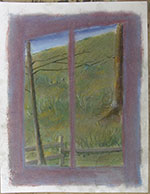
 Strange Frame, pastel and acrylic on paper ca. 14x10 in. Small piece with the strange frame/border took new direction. Tiring of the naturalistic hillside, and, actually, the whole thing, I've overpainted in semi-transparent whites and grays, each area differently. Called Strange Frame. Will see.
Framed Three Horizons for "Beyond the Box" at the Lubeznik Center for the Arts, and Sigma for 67th Salon at Northern Indiana Art Center. Received acceptance of Fullness for "Contemporary Realism" at the Christopher Gallery, Prairie State College.
.
8/31
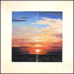
 Good bye Whispers, hello Mt.Ste.Victoire. Removing top two areas, leaving the bottom two, one looking like Mt. Ste. Victoire, and the other like, perhaps a descending meteor--both are accidental, in flux, and totally contemporary in concept, even to their vagueness. What happens to the rest remains up in the air.
9/2
Just back from an art opening. Lots of expression and esthetic stuff. I wonder, how many would be interested that the daskboard lights reflected in the moon roof are more signficant than the stars beyond the roof?
9/7 Ascent to creativity or descent to chaos? 
9/9
Inspired to do another type of main field, this time on Mt. Ste. Victoire. Thick white, drawn into with charcoal and blunt end of brush, painted over, etc. May include charcoal dust to bring out the relief, but I think that would be too obvious. The statement should be subtle, rewarding continued looking.
9/14
Finished Mt. Ste. Victoire. Intensified the mountain with glaze varnish, then flattened it to look a bit more like Cezanne, but not too much. Put a varnish coat on, with different intensities, to pick up on the subtleties of the surface. Will do the same with the final varnish. Right now, I like its clumsiness and eloquence.
9/21
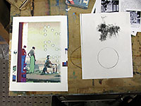
Seats of Wisdom finally coming into focus over the past weeks. Didn't know what I wanted at the start, just liked the idea of the precise marks and loose brayer marks on the justification sheet for the print Sin a ma. Pasted it on a field I made on canvas, mostly flow. Then lots of working with technique in order to make more expressive. tearing, thickness of paint, flattening air bubbles under the paper. Reinhardt comment in black rectangle over black. Tear-through at top, in "screen," led to others. Flesh. Free strokes. Finding meaning. It's all real and yet jockeyed in our minds.
Seats of Wisdom early stage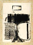
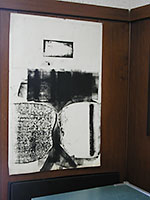
10/3
Finished Seats of Wisdom. Spent more time on the damn PAPER TEARING, gettting just the right shapes and edges, than I think I did actually painting. Getting the finial finish on the Reinhardt rectangle and the proper gesture salute to the automatic painitng school were tricky. Kinda goofy piece, somewhat out of the ordinary, but not as different as some studio visitor thought. This piece is the other side of Mt. Ste. Victoire. In fact all of my pieces are yin-yangs of Yin-Yang.
10/21
Between taking down shows, putting up shows, and holding an open studio, I probably have put down a cubic milliliter of paint. Two sketches have some promise, with "Woman Floating" already sketched into a 36 x 48 in painting. She accompanies three ancient (pre-Columbian?) heads, a brooding, seated figure, and a small paper framing of part of the initial background.
The other sketch is of my studio wall, done in my spare time during the Open Studio. The sketch tells more than it shows.
Woman Floating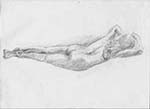 Studio Wall afternoon
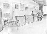
10/23
Upgraded Painter (to 9). Somewhat like painting (paints can be mixed like oils on a palette), I still do not think it's that good for me. As I overheard the Cracker mumble about gator-eating tourists, "if they WANTED chicken, why didn't they ORDER chicken?!!!" However, got an idea for superimposing a bottle over my experiments, calling it "Cull de Sac." I quite possibly can do something interesting via experimenting which I can cull, thereby escaping the cul de sac of one medium imitating another.
10/25
Finished Unafreud (acrylic and collage, 20 x 30 in.) by painting the right look on the face of the main figure, even though I didn't know what it was going to be when I started. It "fell into" a benign-yet-not-gooey look. He accepts and shares the simplicity of the child's drawing and the inner selves of people, that part religions, rites, and philosophies try to tether and allow.
11/2
Working on Nearly Simultaneous. The upper right figure is less attached and orderly. The faces of the ancients are sketched in, and the former frame is much smaller. Naming a piece so early, for the sake of referencing in this log, is not turning out to be a problem. As I mull over possible titles, I make the piece in several ways in my head. The title and general thrust of the work come together, as they always have, but in a different way. The key was deciding that the "flood" field was okay if I made the ancient faces "part" of that continuum. (Somewhat like the print Momentary Universe.)
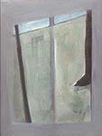
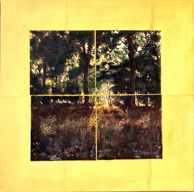
Also have finally prepared a small, 20 x 20 in. canvas to complement Landscape. Skyscape will also be torn into four squares, allowing the surrounding yellow light/energy show through and surround the "world as we know it." There's also a bit of "yes, I DO know how to paint 'realistically' punch-backs in these two pieces. For Skyscape, I'm going to have the sun set right in the space between the two lower squares, right where the light of the universe stained into the plain old canvas shows through. Maybe viewers, with this "clue," will go back and look at Landscape in a deeper way. The sky I'm doing is from the third study. The first, with 4 different skies, I had to keep kicking to get it to evolve--never a good sign. The second, a straight up view, with a wire running across the sky and tree branches coming in from the sides was itself "saying" what I wanted to say by letting light come through the breaks.
11/13
![]()
 The "realistic" sky for Skyscape is almost finished, ready to be torn into four equal squares and attached to the yellow canvas.
Also worked on the floating woman in Nearly Simultaneous.
11/18
Primordial and Present, computer, 12 x 12 in.
Decided to mess around on the computer with the first study for Skyscape, which had four different sky views, and which I rejected for the painting. Became hooked as the new images I loaded in and tried clicked into a place I could not put a finger on. That first night, stayed up til 1:00 am. Over the next two days tweaked and capitalized on one major accident, a view that changed the yellow background to a deep red. That red grew into a warmer and lighter element, reminding me of the cosmic background radiation, which idea fit in well with how I thought the piece itself was going. The title reveals the evolution: Primordial and Present.
![]()
![]()
![]()
![]()
![]()
![]()
![]()
![]()
 Made a drawing while I was helping someone else learn to draw. I went back to it several times, so it must mean something to me, but I do not know what. Beauty in a corner? Planes, from physical to cognitive and beyond? Perhaps its meaning will spin out over the next few months.
Moved the "frame" in Nearly Simultaneous so that the figure in upper right not tied into the composition, but balances, and is somewhat opposed to the heads, frame, and floating figure.
11/28
Fourth layer on "realistic" sunset. Finally getting out of the merely representational to where I can make it look real but have my own language.
Did a self-portrait: Bob Sepia Universe. Molecules are jumping; the universe is vibrating.
11/30
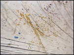
Experimented, looking for chaos and order, with a scan of the scanner lid. Much time, little results (see "failed"). Then, about to close up shop, I noticed a fragment of the experiment that might be developed. (see "fragment"). Making it into a horizon line led to triteness. Realizing the line itself, and its relationship to colors and shapes, might be intriguing, I did more experimenting. Success! I think. I like it, but have no use for it now; and it doesn't want to grow into a full-blown piece. So, it's into my "Resources" folder.
 failed
![]() fragment>
fragment> ![]() <success
<success
12/6
Seascape, acrylic on paper and canvas, 20 s 20 in. finished. Had to change the yellow field the seascape pieces were attached to--just too strong. Painting over with a thin gesso let some of the yellow shine through. I like the piece, perhaps because it is so candy-lush, and I can't help myself; but it was not exciting, since no new ground was pushed into; rather, it is a companion to Landscape, with its statement that "realistic" is not the only real.
12/26
Then, lying in bed one night, the gathering up began. Thinking of the first pieces I'd made because I'd been talking with a private student about his first works, my spirit jumped. I deserved the same treatment I gave him. As I ran over my first works, I realized that while many of them were inauthentic, student work, there were some that were a strong part of who I was and where I would go with my art. So I began to be drawn, not to something new, but to the deeper currents of my art birth. The first piece was the Klein-like "City #2," done on charcoal paper with printer's ink and a scrap of wood. The second piece, "Lent," was done on newsprint with white chalk and oil, also using a scrap of wood. I still remember the directness and elation of spirit as I did these two. They were pure.
![]() City 2
City 2 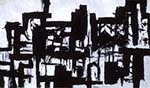 Lent
Lent 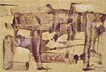
The plunge forward came when I next started to work. Inexplicably cleansed, I made "Study: T." A tree grows out from the left side, while a geometric shape (a part of "T"?) is at the bottom right. This piece, although freighted with references, is also pure to me. It sprang to life with a clean spirit. The references to living experience, to mental abstraction ("'T' is for tree"), to gently associated disassociation, to esthetics (Beauty)---the references were so subtly present when making the work that I barely noticed them. Today I found stretchers the same ratio as the study, stapled the canvas, and was preparing the gesso when another idea hit. The canvas I had used was probably twenty or more years old. As I rotated the 30 x 24 in. piece, to see if it presented anything I could use in the painting, one edge, with its several inches of aging that I originally intended to gesso over, wanted to be part of the work. So, I lightly washed gessoed over left, aged part, and applied it normally over the rest. I will start the painting freely, but I expect that this one will turn out much like the study.
![]() Study: T
Study: T 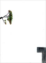
12/28
Aside from working a bit on the 24 x 18 colored pencil-and-gesso-on-paper piece and making coffee, all my time was spent getting a good nothing. I didn't like the gessoed surface of T; it seemed to lack life and the two different surfaces were too different. Went to the squeegee, mixing I hoped just enough water into the titanium white to make it spread and enough medium to give it a subtle life. Wrestled with this surface for a long time, wetting, squeegeeing, scraping, adding, scraping, squeegeeing--it just didn't have the simplicity yet depth I wanted. So, I started wiping. This process went on a long time, also. It is hard to envision just how much of the lightly-gessoed canvas will show through when the white dries. After about three tries, it showed some promise, so I stopped. Next studio perhaps I can start painting the tree and penciling the geometric shape.
![]()
![]()
![]()
![]()
![]() Previous
Previous ![]() Top
Top ![]() Next
Next
![]()
fresco, acrylic, ink on board, 12 x 12 in
acrylic & charcoal, 20 x 30 in
acrylic & collage, 36 x 30 in
acrylic & collage, 20 x 30 in
in progress, 36 x 48 in
computer, 12 x 12 in
mixed on paper, 12 x 9 in